Binding a Wikipedia Article as a Softcover Book
2026-10-09 #graphic_design, #typography, #bookbinding, #art, #typst
This week, my friend Jonathan randomly approached me with the idea of binding the German Wikipedia article on the history of Timor-Leste as a softcover book, as a birthday present for one of his classmates. The classmate stumbled upon its seemingly absurd length (50,584 words) some time in the past year and went down the rabbit hole of the Timor-Leste-related German Wikipedia articles, which are mostly written by one guy.
So I obviously said yes. Bookbinding has always been an interest of mine, even though I kind of gave up on it because of the lack of tooling (large-format printer, guillotine paper cutter) “required” for having fun1. Jonathan, for similar reasons to me getting a forty-year-old VMC, got an old Heidelberger Tiegel (a platen letterpress) from the 60s, with a hydraulic paper cutter from the 80s to match it. Kleinanzeigen be damned.
I started typesetting the book (we settled on A5 paperback). At first we thought about just copy-pasting the article from the Wikipedia website into Adobe InDesign®™ and hoping the rich text would just work, but I quickly gave up on that idea because of the sheer amount of text I would have had to alter manually. An article written for a website includes all kinds of useful info that doesn’t transfer well to the analog medium of a book. Hyperlinks, mainly. Also, very ugly tables and clickable maps crafted from tables (2000s style) had to go: I only had a couple of hours to clean up the article and would probably have had to redesign the tables by hand to fit neatly into the A5 format. It didn’t really hurt the reading experience anyway, since there were only a few tables, largely irrelevant to the casual reader (which I’m sure the classmate would not describe himself as, haha).
Wikipedia to Typst
To get the text into a designable form, I, with my computer-touching background, resorted to the following tech stack. Yes, really:
- curl for getting the HTML from the Wikipedia REST API
- A Python script for fetching all the high-res images from Wikipedia
- Pandoc with a custom Lua script for converting the HTML into Typst
For interested people, I have included all of that in a git repo [link], though I must say the code quality is nothing to be proud of, more a mess of hotfixes and spaghetti code.
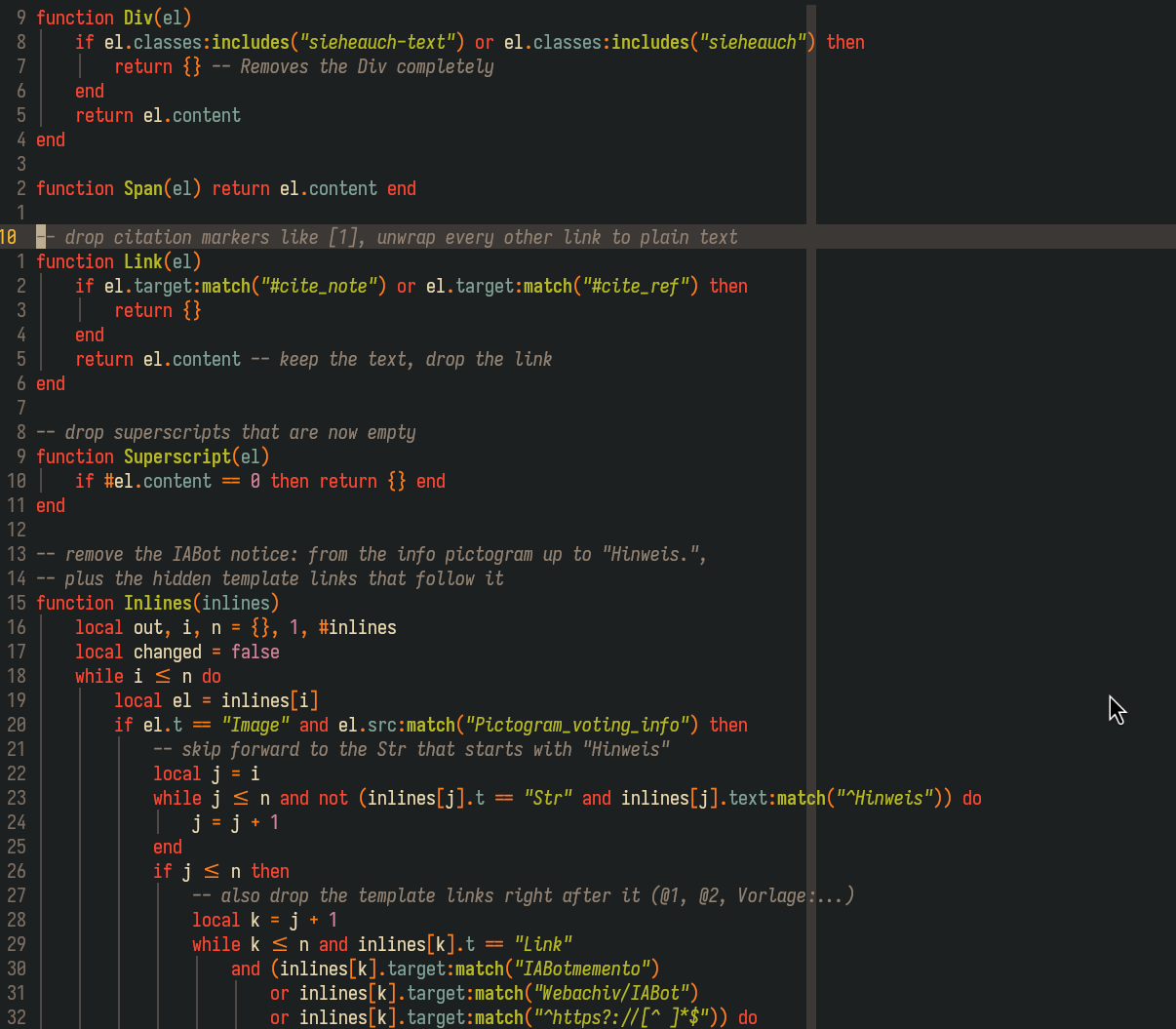
This workflow worked pretty well with my brain and I can honestly recommend it. After I had all the resources, I skimmed through the resulting PDF and found a bunch of ugly parts that had to be removed or changed: weird icons, weirdly placed figures and headlines, and useless hyperlinks, mainly. Then I searched for them in the HTML, noticed patterns in the classes of elements that could be blocked entirely, or moved figures around paragraphs to be less ugly, ran
pandoc -f html -t typst --lua-filter clean.lua --shift-heading-level-by=-1 -o article.typ article_final.html --verbose
again and looked at the result. In the end I had about a hundred lines of cleaning code and was semi-happy with the result. We only had a couple of hours together, so the layout is still rather sloppy, but it’s better than just pressing print in Firefox.
Typography
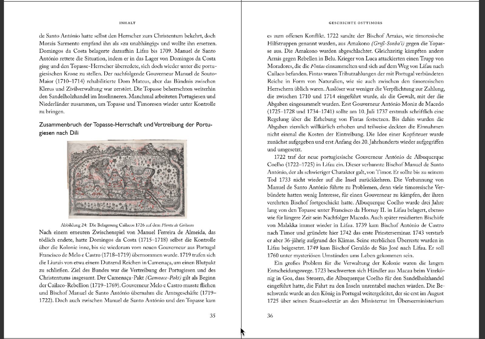 For the body type I knew I wanted a typeface with serifs, because they honestly look really good printed (who could have known, after 500 years of typographers?). I experimented a bit with my favorites. The shortlist:
- Adobe Caslon Pro (which I overuse)
- Friedrich Althausen’s Vollkorn (which also looks good on screen and in smaller type)
- Some kind of Garamond
I first wanted to go ahead with Vollkorn, but at 10 pt it felt too heavy and it inflated the book’s size from 250 pages to 275. So I went with Caslon, reluctantly, because I sadly use it for everything, and I think I made the right call.
For headings I wanted a bit of contrast. I tried both Akzidenz Grotesk and Gill Sans in varying weights but settled on Gill Sans, because I kind of liked the 80s anthropology-book vibes it gave me in combination (yes, I’m weird).
Cover Design
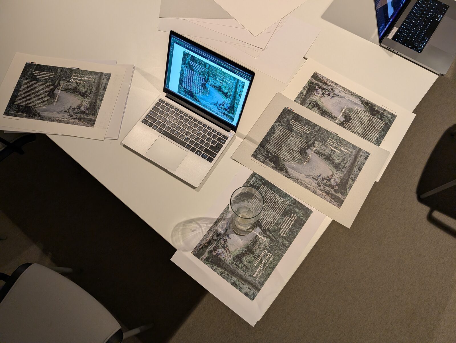 The cover design we went with was basically just the first idea that popped into my head: a dark-ish stock photo spanning the whole cover, with white text in the fonts used in the book. For some reason, using the display typeface Gill for the larger paragraph of text and Caslon Bold and Semibold for the title looked better in this low-contrast situation.
I designed it in VectorCraft, a slopcoded clean-room reimplementation of Adobe Illustrator®™ that was being hyped at the time. I wanted to try it out, and it worked surprisingly well. The fonts worked as expected, the workflow is pretty standard, and even exporting for printing with trim and registration marks and the little color calibration boxes worked on the first try. I’ll be keeping an eye on it, even though Inkscape is still closer to my heart.
Printing
In the past, when I did my bookbinding projects of anarchist literature from The Anarchist Library, printing was always one of the biggest issues. I only had access to my parents’ Ricoh A4 color laser MFP, which produces pretty sharp text, but only if it’s fed the exact right kind of PDF. This is an issue with the Linux CUPS driver, not the printer itself, but that doesn’t materially change the situation when I wanted to print from Linux. Even when it got the PDF/A-1 it wanted, double-sided printing always had loose front-to-back registration, and it was just generally unpleasant. My lack of a hydraulic guillotine was also a hindrance, because the intuitive way of printing, two pages on an A4 sheet front and back, gives you the wrong grain direction for books.
This time everything went extremely well. We duplex-printed each A5 page in the center of an A4 sheet so the grain would run parallel to the spine, and cut the 120 sheets on the guillotine. This wastes a lot of paper, so if we had planned this more than 12 hours in advance, we could have ordered better paper with the right grain direction, color and overall texture.
The cover was printed on a couple of different varieties of thick paper. The old printer in Mönchengladbach, from whom my friend bought the printing press and hydraulic cutter, had also gifted us 400 kg of other random paper on a pallet, and we eventually settled on a paper with an imprinted linen-like texture for the cover. This paper honestly took the whole project to another level, because you just can’t buy stuff like that as a regular person. We were really lucky to have a whole room of random paper varieties in my friend’s parents’ house (sorry for that, btw).
Making the Text Block
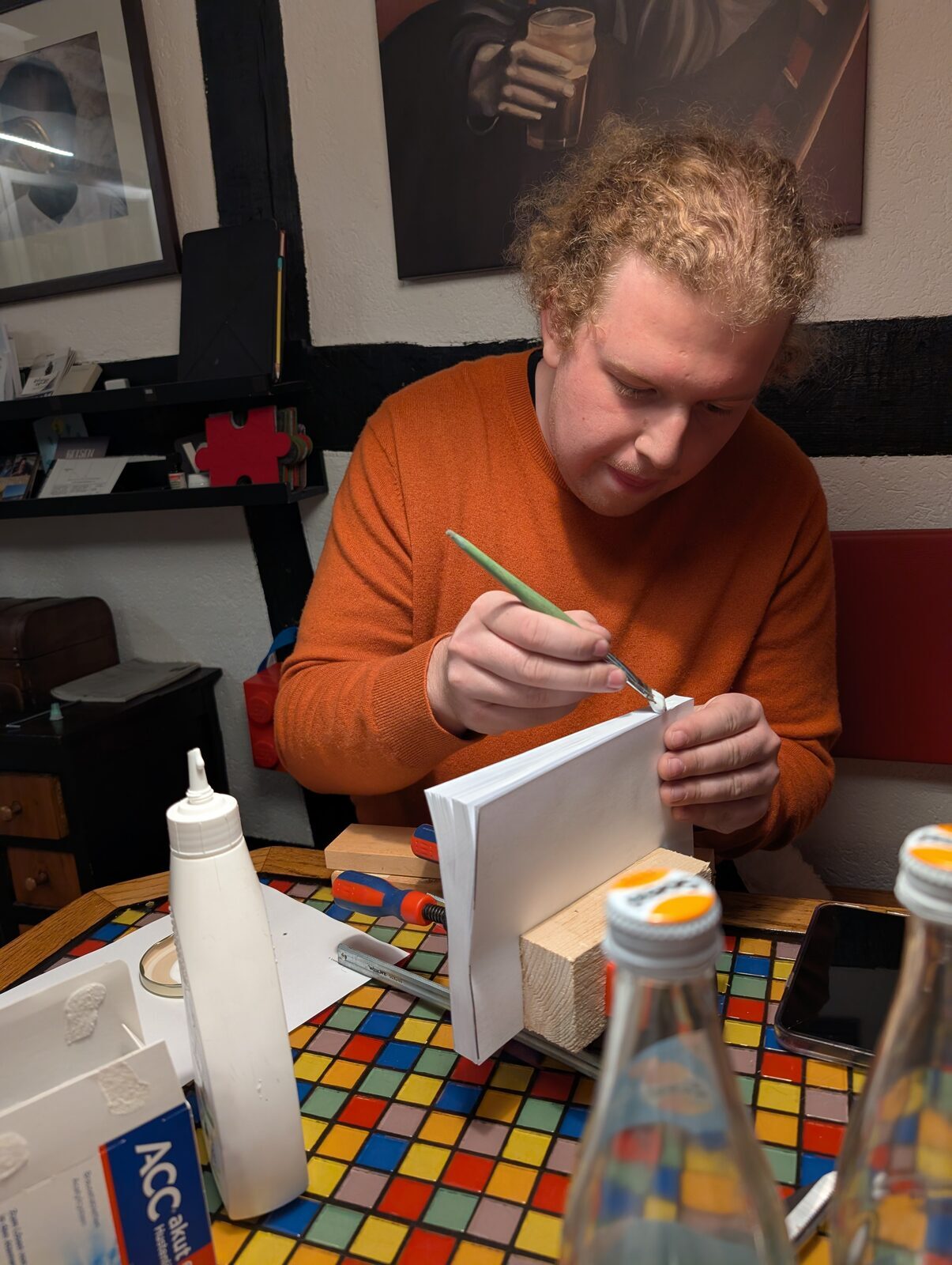
My past projects always involved hand stitching and signatures of 16 pages or so, because I had always tried to make hardcovers (without ever getting that far, so I just have a bunch of text blocks lying around, lol). I was prepared for a couple of hours of manual labor, but just gluing the individual sheets to the spine was trivial in comparison. Making the text block with a technique we had never used before took about 10 minutes in total, lol.
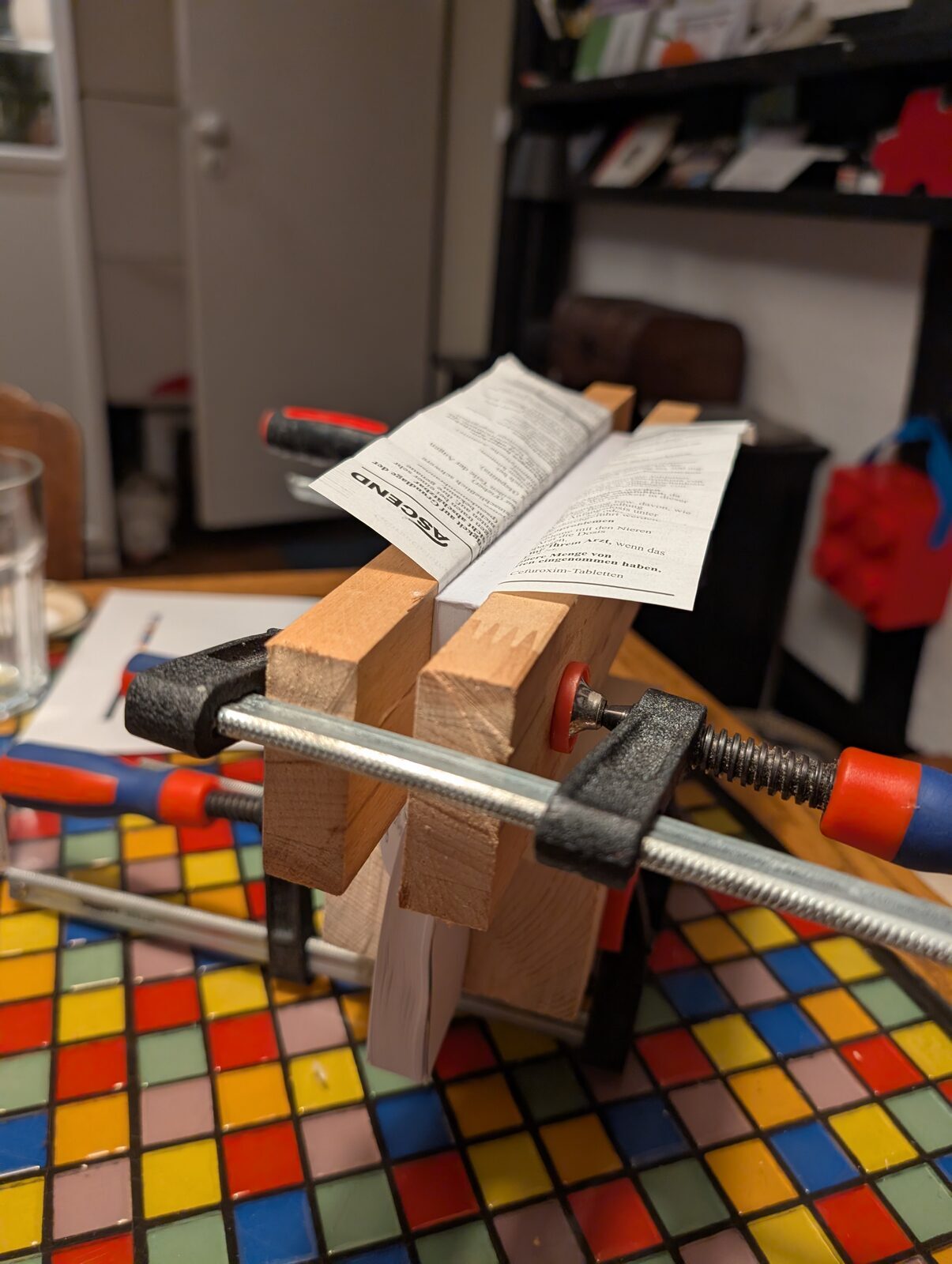
Preparing the Cover
I added about 5 mm of bleed to the cover when printing, so the picture would definitely go edge to edge and we’d have a bit of wiggle room to line up the text on the spine with the spine of the text block. Even so, and even with the absurd lack of proper hand tools (we had to use a surgical scalpel because we didn’t have a craft knife, and a piece of mild steel flat bar because we didn’t have a ruler long enough), it went extremely well. We just had to do a bit of math, because we didn’t trust our hands to stay steady enough for transferring the crease lines so the text on the spine would be centered.
The technique was also very simple. We copied it from the “make your own paperback using basic tools” tutorial video: you mark creases that match the thickness of your text block, and then two more, seven millimeters further out, so the cover has more glue area without that area being stressed each time the book is opened.
Final Glue-Up
We thought about a whole bunch of elaborate ways to clamp cover and text block together in two directions simultaneously, before watching the two-minute section of the video and learning that the technique is just: add glue to the cover and the text block, press them together, and put a weight (not even a heavy one) on top while the book lies with its spine perpendicular to the table.
Trimming
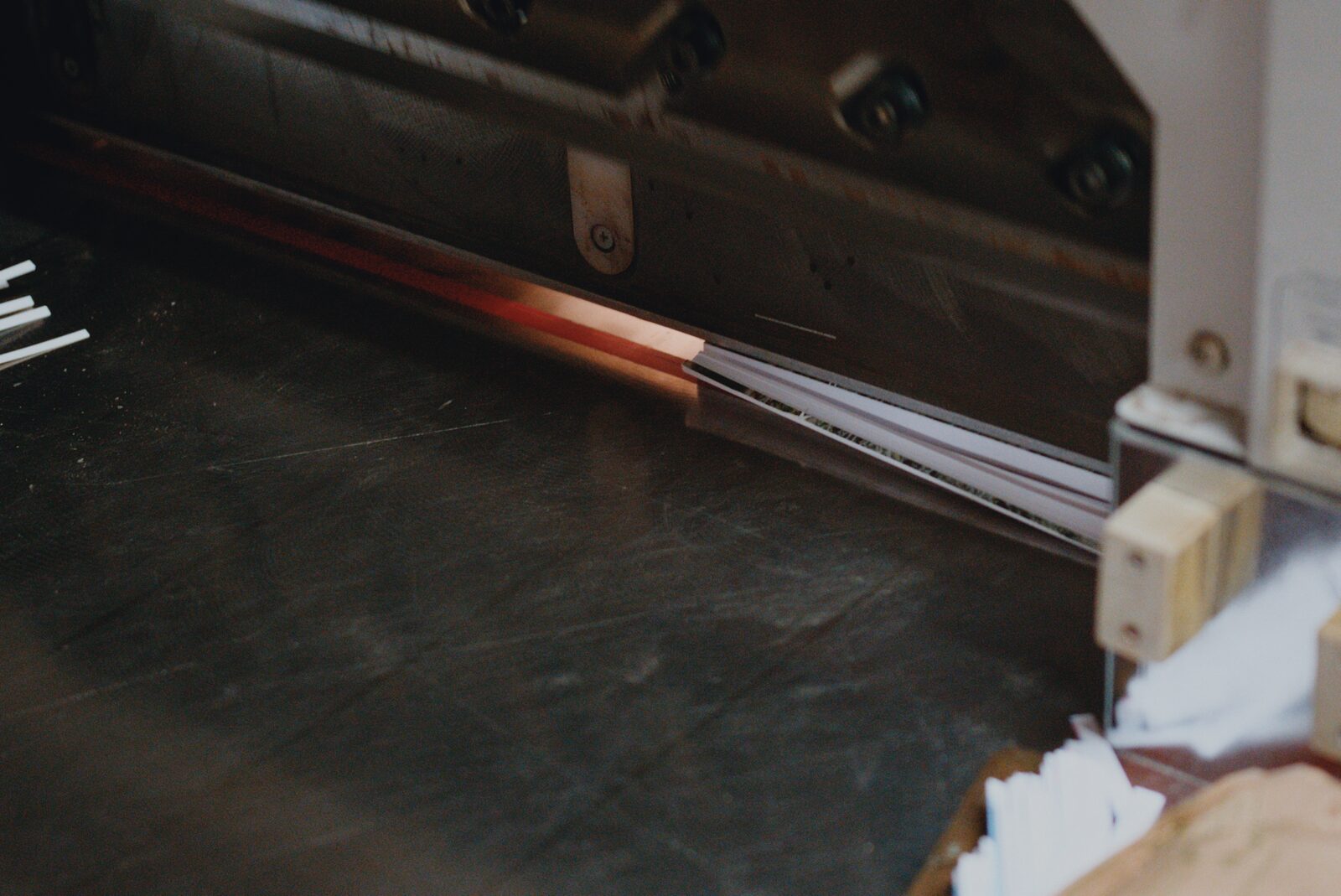 After waiting another hour for the glue to dry, we took the quasi-finished book to the workshop to trim off the bleed and get the edges nice and smooth. I had seriously attempted this before with just a ruler and a craft knife, going over each edge 30 times or so and always achieving a much worse result.
Conclusion
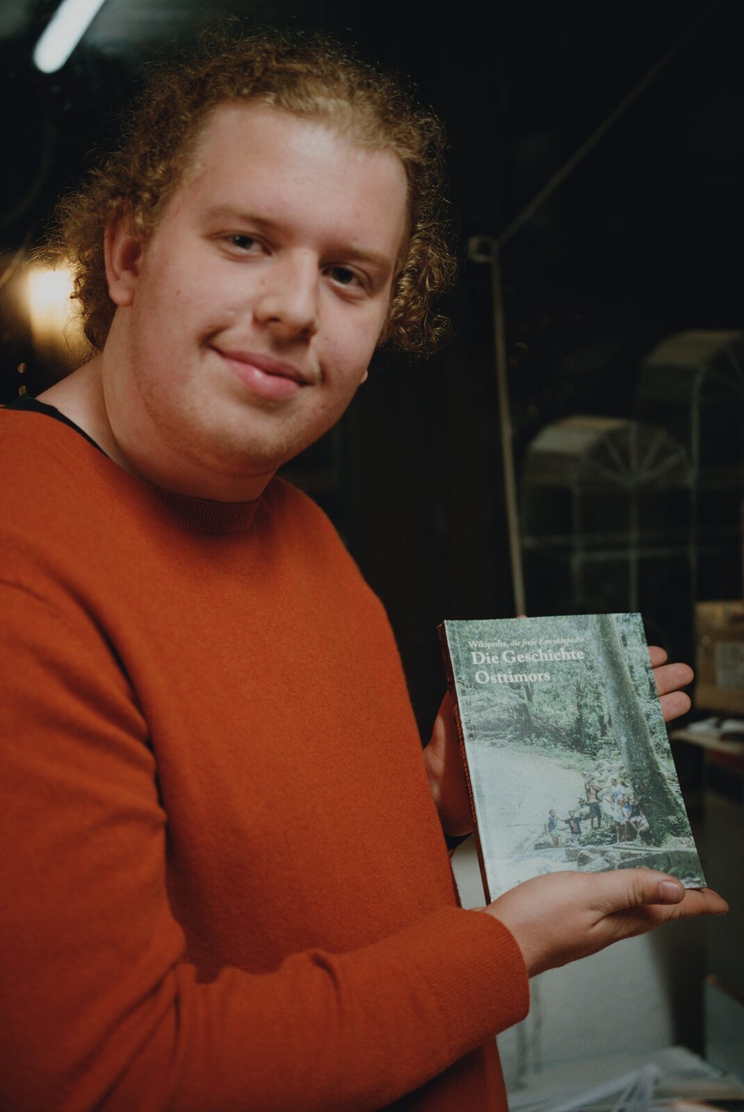
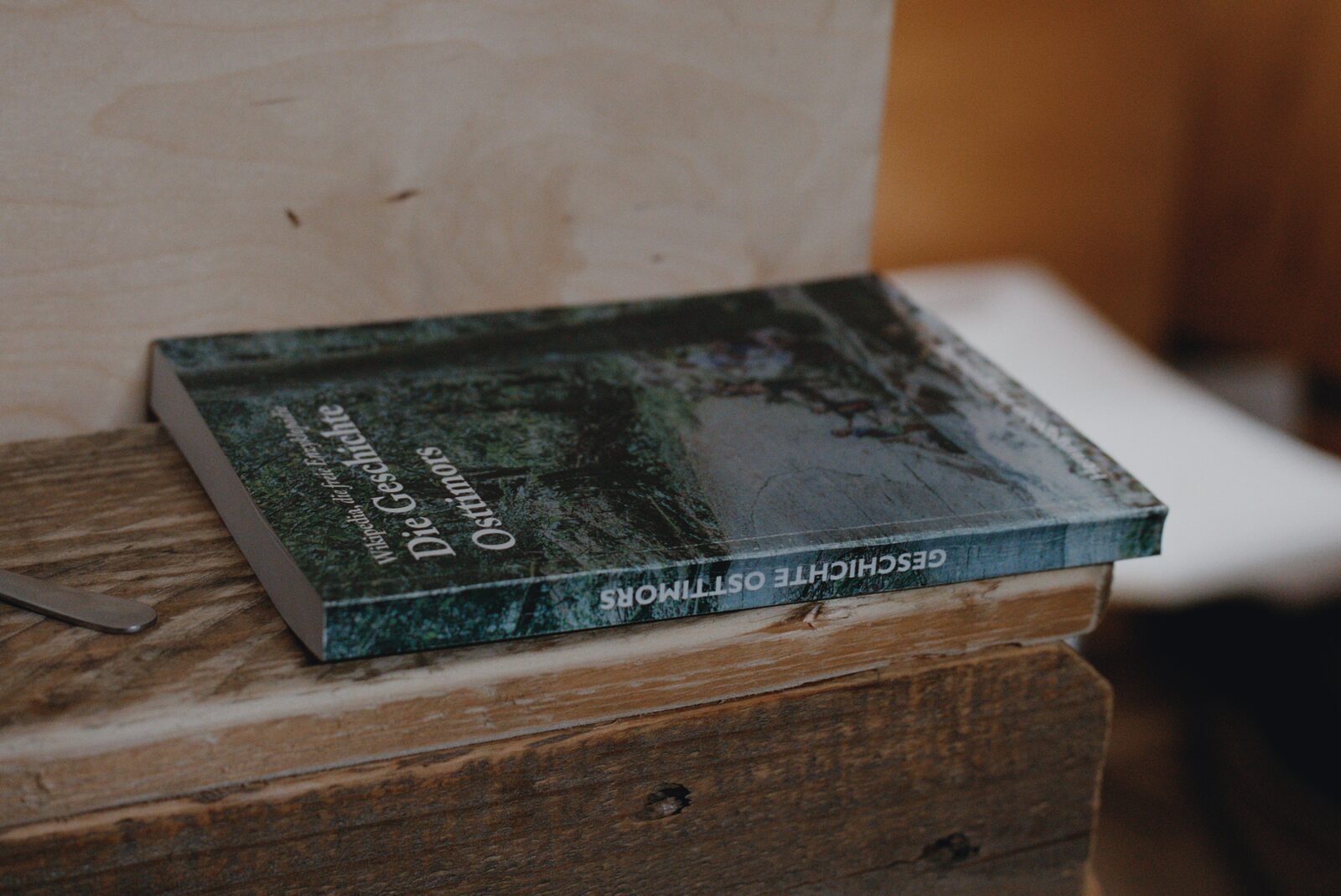 The resulting book is almost perfect from a physical point of view. Much better than we hoped, to be honest. I can recommend this to anyone wanting to get into bookbinding, only later “graduating” to stitching and hard covers. I’m sure I’m going to use this technique again with a different text.
If you ever read this: Glückwunsch zum Geburtstag, Joel!
- It’s obviously not required, just look at the YouTube channel of DAS bookbinding, who achieves much better results than we ever could without fancy machines. I just suffer from G.A.S. (Gear Acquisition Syndrome), and it makes the process much easier.